Background. I’ve had Tahoe installed as a beta on my Mac Mini since June 2025. I’ve used it a lot over the last 7-8 months. So any normalization of the UI should be in full swing by now. This is the first post in what I think will be many as I document my usage of Tahoe and some of the thoughts I’ve been ignoring or passing over in my past usage.
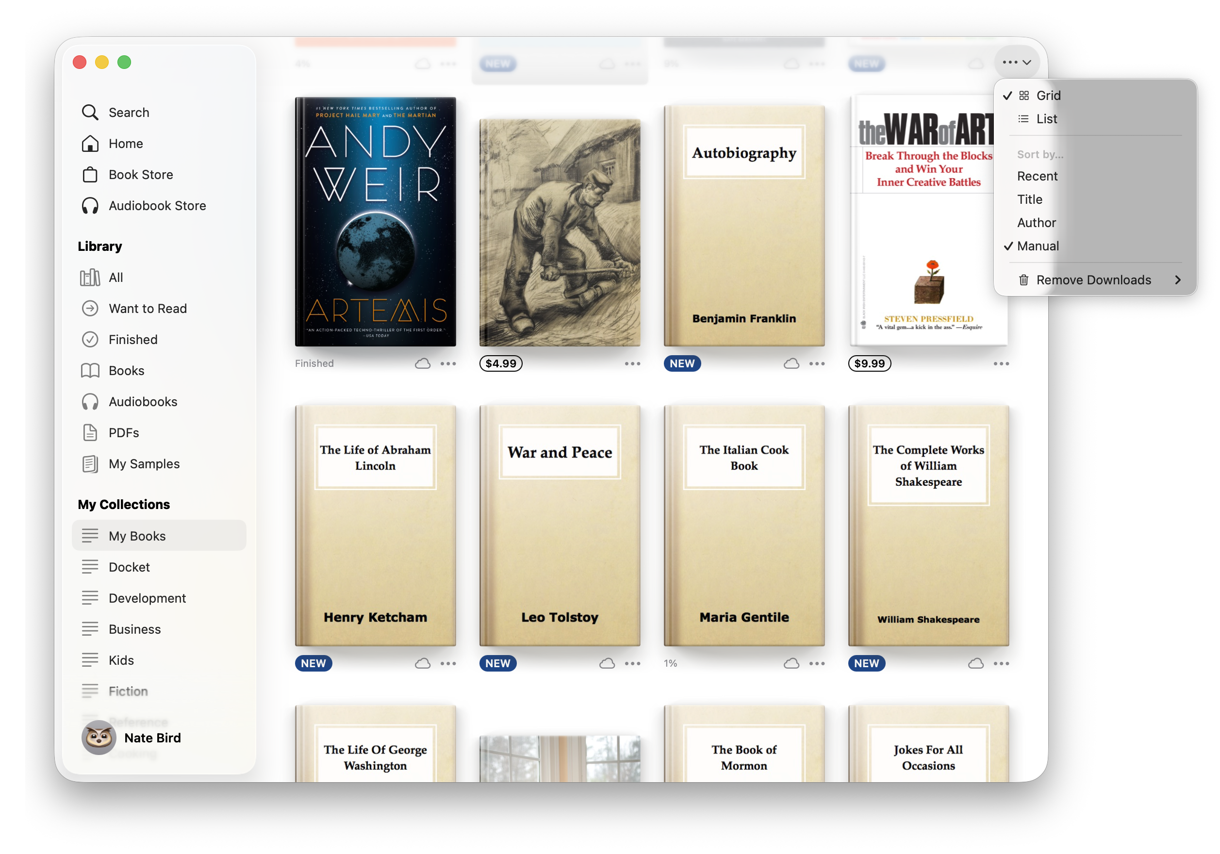
Se the attached image for visual description of the bad parts of the UI of the Books app.
Top left
I keep finding myself questioning whether the Window buttons (Close, Maximize, Minimize) apply to just the sidebar or to the whole window. I know the answer but there is definitely still a cognitive load based on where the buttons are placed in the left sidebar and not in a window menu bar.
Bottom right
The content of the window is allowed to scroll under the sidebar. But the contents of the sidebar are also allowed to scroll under other elements in the sidebar. Really? Do you see that list scrolling under my account link? At first I thought it was something behind the sidebar but it took a second to realize it was just the sidebar list going under another item in the sidebar. What if there were books under the sidebar too? Would those also stack under the translucent sidebar?
Top Right
We have all this room at the top of the window and there are only three (3!) possible buttons to make accessible for the user directly but instead they are stuck in a generic {…} button with a down chevron. It has a view (grid vs list), sort by (recent, title, author, manual), and what I think is an App setting, Remove downloads (automatically or manually).
This is a disappointing UI for the books app. Options are less accessible as they require a click on a button that has no context. The top right could easily just be two buttons, one for the view toggle and one for the sort toggle with actual icons that represent what they do.
The translucent sidebar is just a mess. I think the translucent sidebars and top bars should be scratched. They are bad in so many ways. I don’t know how you salvage it without just making them opaque. I think they actually have negative utility because they cause cognitive load to the user trying to discern what is the blurred content under the bar.